Designing Time: A Guide to Creating Unique Watch Dials
Designing Time: A Guide to Creating Unique Watch Dials
In the world of custom watchmaking, every element of a timepiece plays a significant role in defining its identity. One of the most prominent features that catches the eye and embodies a brand’s personality is the watch dial. I know how important a good watch dial is for engaging the audience and building a brand.. In this article, we’ll guide you through the art of creating unique watch dials that leave a lasting impression. In respect to my own company (Jadeion Watches), I’ve had custom dials made with my Dragon logo, have had chrome adhesives for sterile dials, and have had my logo simply engraved into the dial.
The most important part is how the prospective customer views not only dragons, but what it may stand for. Most times, it’s the unique perspective of the customer that buys into the watch, far before they understand the story behind the dial. Regardless, a clear, memorable dial (next to the case/style) is the most important aspect of the brand aesthetics.
The Canvas of Expression
Think of a watch dial as a canvas waiting to be adorned with intricate strokes of design. The fonts, layout, colors, and even textures of the dial contribute to the overall aesthetic. I recommend beginning with a clear brand identity. What story do you want your watch to tell? What emotions should it evoke? Answering these questions will guide your design choices.
As an example, the Jadeion brand story is simple. I made our brand for the person caring for their families. It’s a proverbial pat on the back. And, the Jadeion Dragon represents the strength behind this important aspect of leadership. Yet, even I struggle to get that point across as if I was the plumber with leaky pipes. Therefore, it’s CRUCIAL to get third party perspectives, those who can be open, honest and completely candid about your mock-up designs or logo.
Font and Layout Selection
Typography plays a crucial role in conveying the essence of your brand. Serif fonts may evoke a sense of tradition and luxury, while Sans-serif fonts bring a modern touch. The placement and arrangement of numerals, indices, and logos on the dial determine the watch’s readability and visual balance. Consider experimenting with different layouts until you find one that aligns with your brand’s character.
As an example, here’s our text-only Jadeion logo, which uses a font that stands out.

Colors that Speak Volumes
Colors have a profound psychological impact and can instantly communicate your brand’s message. For example, blue may evoke a sense of reliability and professionalism, while red might signify energy and boldness. The choice of colors should harmonize with your brand’s story and target audience. Keep in mind that color combinations should be visually pleasing and easy on the eyes.
In marketing, we’ve always known what blue and brown can do together. This is why you’ll see it so widely used in newscasts. I even remember when Joe Rogan switched his studio to all red, which was horribly received. Red can simply be too aggressive, but the perfect color for a watch based on its purpose.
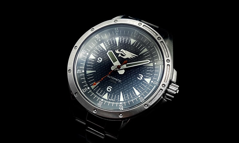
Textures and Finishes
Textures on the dial can add depth and sophistication to your watch. Techniques like guilloché (intricate engraving), sunburst, or brushed finishes can give your dial a unique appearance. I encourage microbrands to explore the world of textures to create dials that stand out like the Liv brand has. Remember, the texture should complement the overall design and not overpower it. Sometimes it’s easy to use an all black, no indices dial which allows attention to be put on the hands or a small logo. But this depends on the brand and what they’re trying to accomplish. For you, it may be a completely custom laser engraved dial that would be near impossible to replicate.
Bringing It All Together
The process of designing a watch dial requires a delicate balance between creativity and practicality. Your design should not only reflect your brand’s identity but also ensure legibility and usability. It’s essential to create a prototype of the dial design and test it under various lighting conditions to ensure that the dial remains readable.
Below are a few of our Microbrand friends with some pretty great designs. Simply click on the names to see their websites.